
Twenty-one builders. Each takes the props in its own table plus every shared prop, with its children as the array part of the same table. Data props take a field ref (text = f.title), a literal, or a derived function; input props take a function. To see how any of them lays out, Perch Studio’s preview has a Boundaries toggle that outlines every node with its type; Displays: seeing the layout shows what it looks like.
An unknown prop raises at construction with your file and line (ui.text: unknown prop 'colour'); a value outside the allowed range fails the load with the exact node path.
Sizes are design pixels; Perch scales them with the user’s notch scale.
On the wire, and in a validator message, ui.column, ui.visualizer and ui.sparkline are the node types col, viz and spark.
In the tables below, f.x stands for any field ref of the right kind (or a literal, or a function of the data); it.x is an element ref inside a repeater.
Containers
ui.column, ui.row
Flex column and flex row.
| Prop | Values | Meaning |
|---|---|---|
| children | the array part | the nodes inside, in order |
gap | ui.gap.xs (3) | ui.gap.s (6) | ui.gap.m (10) | ui.gap.l (16) | number px | space between children |
align | ui.align.start | .center | .finish | .baseline | .stretch | cross-axis alignment; ui.row defaults to center |
justify | ui.justify.start | .center | .finish | .between | .evenly | main-axis distribution |
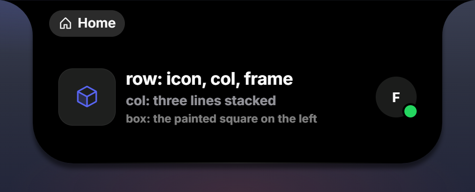
ui.column { gap = ui.gap.xs, align = ui.align.start,
  ui.text { text = f.title, role = ui.role.title },
  ui.text { text = f.sub, role = ui.role.label },
}
ui.box
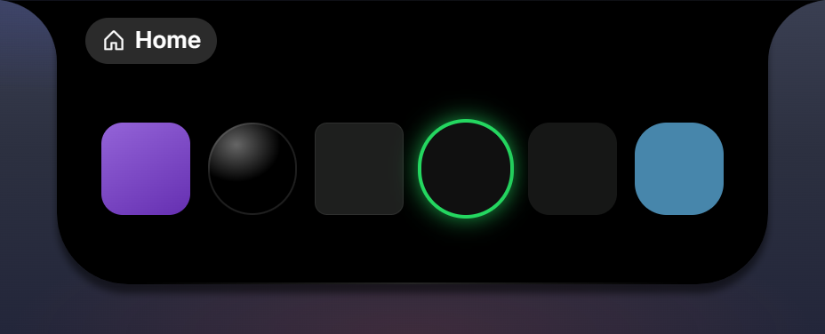
A ui.column-like container meant to be painted: give it bg, radius, ring or border. Defaults to a recessed surface with the card radius. The clock’s dial face, the presence dots and the launcher’s tiles are boxes.
| Prop | Values |
|---|---|
children, gap, align, justify | as ui.column |
ui.box { w = 44, h = 44, radius = 999, bg = ui.bg.deep, border = ui.border.rim_strong }ui.frame
Absolute positioning. Every child must carry at = { x, y } or at = { x, y, w, h }; with anchor = ui.anchor.center the child’s at is its center point. Clock numerals, badges on avatars, and overlays on discs are frame children. Images and shapes must land on whole pixels: they pixel-snap, so a fractional at, w or h (or a centre anchor that resolves to a fractional top-left) would jump 1 px the moment a transition ends. The runtime rounds image and shape boxes for you and the validator warns about the fractional source; write odd sizes on .5 centres.
ui.frame { w = 26, h = 26,
  ui.image { at = { 2, 2, 22, 22 }, radius = 999, src = f.avatar },
  ui.box { at = { 16, 16, 9, 9 }, radius = 999, bg = ui.color.live, ring = { 2, ui.color.island } },
}
Error when a child lacks at: frame children need at“.
ui.scroll
A ui.column that clips its children and scrolls vertically, and only when they overrun its height. While the content fits nothing is different: no bar, no gutter. It needs a bounded height to scroll against, either h/max_h or flex = 1 inside a column. Children keep their natural height, so the overrun scrolls instead of crushing. The scrollbar is the one the settings lists use, and the mouse wheel scrolls it in the expanded panel.
| Prop | Values |
|---|---|
children, gap, align, justify | as ui.column |
ui.column { gap = ui.gap.s, flex = 1,
  ui.text { text = "Queue", role = ui.role.label },
  ui.scroll { flex = 1, gap = 4,
    ui.list { items = f.tracks, max = 64, item = function(it: track_refs_t): node_t return ui.text { text = it.title, size = 12 } end },
  },
}
ui.grid
A CSS grid. Either fixed children, or a repeater over a list field; not both (grid takes bind+itemORchildren, not both).
| Prop | Values | Meaning |
|---|---|---|
cols | integer 1..12 | column count |
gap | number px | column gap |
row_gap | number px | row gap |
align, justify | as ui.column | |
items | f.<list> | the field.list to repeat over |
item | function(it: <element refs>): node_t | builds the template from the element’s refs |
max | integer | repeater cap, default 64 |
ui.grid { cols = 7, row_gap = 1, items = f.cells, max = 44,
  item = function(c: cell_refs_t): node_t
    return ui.text { text = c.d, size = 10, align = ui.align.center, when = c.k:ne("hdr") }
  end }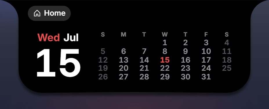
ui.spacer
An empty flexible filler (flex: 1). Pair it with show to push neighbours apart in one form only.
ui.spacer { show = ui.show.single }Text and icons
ui.text
| Prop | Values | Meaning |
|---|---|---|
text | f.x / string / function | the text |
role | ui.role.*, see below | a type-ramp preset |
size | 4..120 | font size px (overrides the role) |
weight | 100..900 | font weight |
tracking | -0.1..0.3 | letter spacing in em |
line | 6..100 | line height px |
lines | 1..4 | max lines; clamps and ellipsizes |
align | ui.align.start | .center | .finish | |
caps | boolean | uppercase |
prefix, suffix | string | added around the value |
map | { value = "shown", ... } | translate the value through a table |
max | integer | truncate the value to this many characters with an ellipsis |
color | color or f.x |
Roles (ui.role.title, ui.role.h2, …) and what they set:
| Role | Size / weight | Color | Notes |
|---|---|---|---|
title | 17 / 700 | primary | tight tracking |
h2 | 18 / 700 | primary | |
body | 13 / 700 | primary | the default |
sub | 13 / 700 | secondary | |
label | 11 / 700 | secondary | |
caps | 10 / 700 | half | uppercase, wide tracking |
value | 13 / 700 | primary | tabular digits |
big | 25 / 700 | primary | tabular digits |
huge | 65 / 700 | primary | line height 0.95 |
meter | 24 / 800 | primary | |
unit | 13 / 700 | tertiary |
Text never wraps unless lines is set; a long value is ellipsized.
ui.text { text = f.temp, suffix = "°", size = 25, weight = 700 }
ui.text { text = function(d: { count: number }): string return d.count .. " online" end, role = ui.role.label }
ui.label "players online"                        -- shorthand for role = ui.role.label
ui.value "09:41"                                 -- shorthand for role = ui.role.value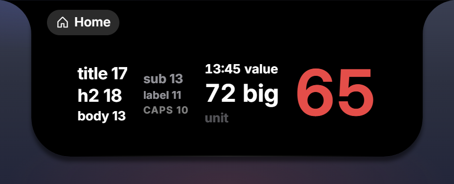
ui.icon
A Phosphor glyph. ui.glyph.* holds every name, snake_cased (ui.glyph.gear_six is the glyph gear-six), so the editor completes them.
| Prop | Values | Meaning |
|---|---|---|
glyph | ui.glyph.* or f.x | an unknown name draws squares-four |
set | "duotone" | the two-tone face; omit for the single-weight line icon |
size | ui.size.s (13) | ui.size.m (17) | ui.size.l (24) | number 4..120 | |
color | color or f.x |
ui.icon { glyph = ui.glyph.gear_six, set = "duotone", size = ui.size.s, color = ui.color.half }
Pictures
ui.image
A bound or static picture: album art, avatars, app icons, game headers.
| Prop | Values | Meaning |
|---|---|---|
src | f.x (a field.image()) or a URL | https://, file:// (paths Perch gave you) or data: URIs |
fit | ui.fit.cover | ui.fit.contain | default cover |
fallback | one node | a glyph or monogram shown until the image decodes |
flip | string | a glide anchor; with flip = "media-art" the image performs the 3D flip on next and previous |
Loading is preload-and-retry: the old picture stays until the new one decodes; a URL that fails is retried with backoff for a while (art files land a moment after they are named); a declared bg shows through while imageless. A ui.visualizer with palette = ui.palette.art in the same widget takes its colors from the decoded image.
ui.image { src = f.art_url, fit = ui.fit.cover, w = 100, h = 100, radius = 18, bg = ui.bg.well,
  fallback = ui.icon { glyph = ui.glyph.music_notes, size = ui.size.l, color = ui.color.half } }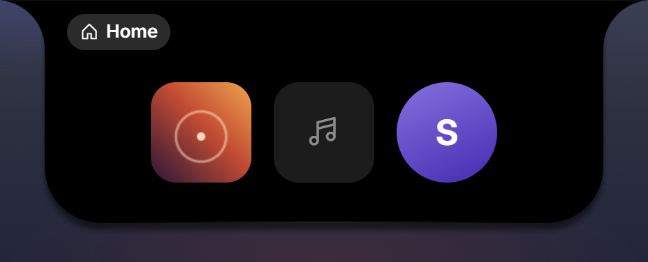
ui.shape
Retained vector art. Either static paths, or a named set shapes picked by a field; one of the two (shape takes paths(static) ORshapes+bind (data-picked)). Art normally comes from .svg files via src / srcs (compiled at load, see The package); inline forms are accepted too.
| Prop | Values | Meaning |
|---|---|---|
src | "glyphs/x.svg" | one static glyph from a file |
srcs | { key = "file.svg", ... } | a set picked by pick |
pick | f.x (a string field) | which glyph of the set |
vb | { w, h } or { x, y, w, h } | the viewBox (required for inline forms) |
paths | array of 1..256 path entries | inline static art |
shapes | { key = paths or { vb, paths }, ... }, up to 32 keys | inline set, picked by pick |
A path entry: d (SVG path data, 8,000 chars max, digits letters space comma dot minus only), fill, stroke (colors; ui.color.current follows the node’s color), width 0..10, cap butt | round | square, join miter | round | bevel.
ui.shape { src = "glyphs/phone.svg", w = 13, h = 13, flex = 0 }
ui.shape { pick = f.icon, srcs = { sun = "glyphs/sun.svg", rain = "glyphs/rain.svg" }, w = 34, h = 23 }
ui.shape { vb = { 24, 24 }, w = 21, h = 21, paths = { { d = "M8 5v14l11-7z", fill = ui.color.current } } }
Meters
ui.bar
A horizontal progress or seek bar. Bound value: a fraction 0..1; a negative value shows an indeterminate shimmer.
| Prop | Values | Meaning |
|---|---|---|
value | f.x (a number field) or a number | the fraction |
height | number px | thickness; also its radius. Default 5 |
track, fill | colors | default the track surface role and the fill color role |
hot_at | number 0..1 | above this fraction the fill turns red (the danger color) |
snap | boolean | fast width transition, for wheel-driven feeds like volume |
knob | boolean | a draggable dot |
seek | boolean | dragging scrubs locally and calls on_seek live while the value moves (at most once per 80 ms), then once more on release with the final value |
on_seek | function(ctx: input_context_t) | ctx.frac is the 0..1 position |
step | number | the fraction one wheel notch over the bar nudges it by; default 0.02 |
ui.bar { value = f.pos_frac, height = 5, track = ui.color.well, knob = true, seek = true,
  on_seek = function(ctx: input_context_t) act.seek(ctx.frac or 0) end }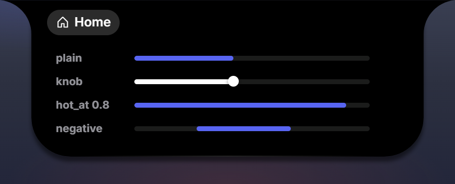
ui.ring
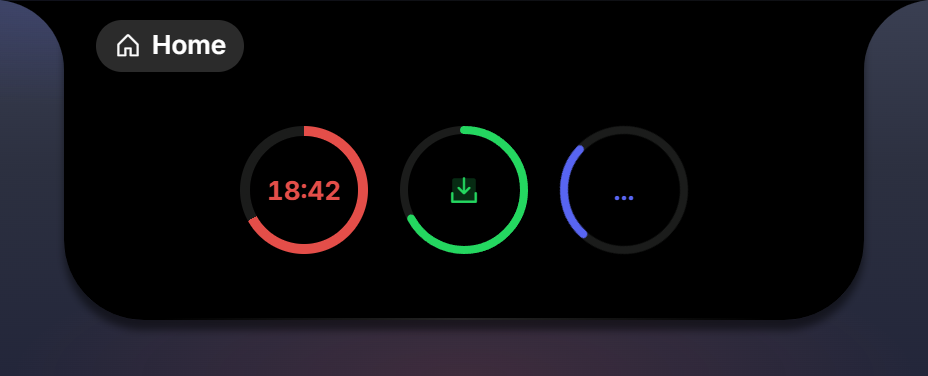
Circular progress around centered children. Bound value: a fraction 0..1; negative = indeterminate (a spinning segment).
| Prop | Values | Meaning |
|---|---|---|
value | f.x or a number | the fraction |
variant | ui.ring_style.conic | ui.ring_style.stroke | a conic sweep (pomodoro) or an SVG stroke dial (downloads) |
size | 1..400 | diameter px, default 26 |
thickness | 1..400 | px, default 3 |
color | color | the progress color; defaults to the node’s color, so a style rule recolors it |
track | color | |
cap | butt | round otherwise | |
smooth | 0..10 | seconds to glide between pushes, so a once-a-second countdown sweeps instead of stepping |
| children | the array part | centered inside |
ui.ring { value = f.frac, variant = ui.ring_style.conic, size = 88, thickness = 5, color = ui.color.accent_warm, smooth = 1,
  style = { f.on_break:is_true():set { color = ui.color.live } },
  ui.text { text = f.mmss, size = 21, role = ui.role.value },
}
The ring’s look token is variant because style is the rules array on every node; a string in style raises ui.ring: the ring's look is `variant = ui.ring_style.conic`; `style` is the rules array.
ui.visualizer
An N-bar audio visualizer. Bound value: an array of levels 0..1 (a field.numbers()).
| Prop | Values | Meaning |
|---|---|---|
levels | f.x | the level array |
bars | 1..32 | default 5 |
bar_w | number px | default 4 |
gap | number px | default 1 |
floor | number | minimum level, default 0.18 |
grow | scale | height | how bars grow |
gradient | 2..8 colors | fixed vertical stops |
palette | ui.palette.art | the bars become windows onto the blurred album art of the nearest ui.image in the widget: one picture behind the row, sliced per bar |
radius | number px | bar corner radius |
ui.visualizer { levels = f.bars, bars = 6, bar_w = 4, gap = 1, radius = 2, floor = 0.18, palette = ui.palette.art, h = 20 }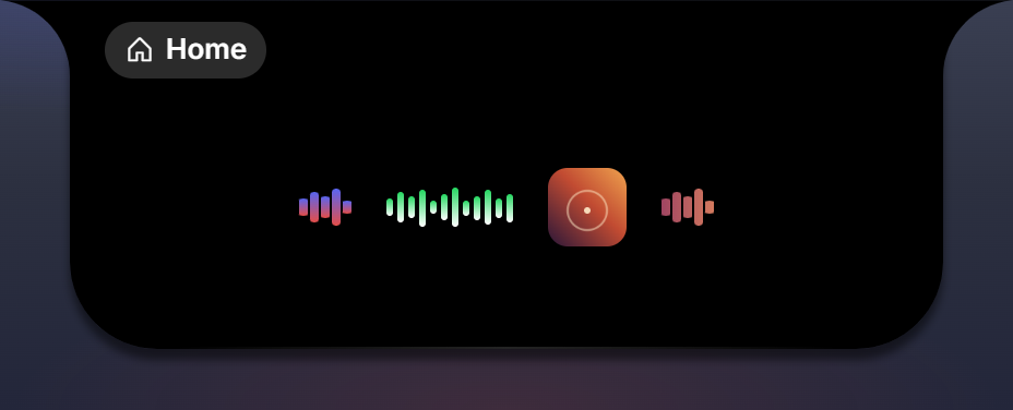
ui.sparkline
A small line chart (96 by 30) with a soft area fade. Bound value: a field.numbers(), or a field.record { points = field.numbers(), up = field.boolean() } where up picks stroke versus stroke_down.
| Prop | Values | Meaning |
|---|---|---|
points | f.x | the numbers, or the { points, up } record |
stroke | color | default green |
stroke_down | color | default red |
area | boolean | false drops the fade |
ui.sparkline { points = f.chart, h = 22, flex = 0 }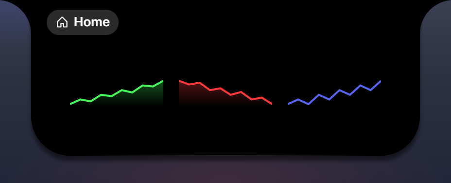
ui.gauge
The clock’s live seconds scale: a curved band of second numbers and ticks that glides to the current second on the view side and stops the moment it unmounts. Self-contained, with no props of its own; place it with at inside a ui.frame.
ui.gauge { show = ui.show.single, at = { 118, -25, 110, 126 } }Time
ui.ticker
Live time text rendered on the view side, no Lua wakeups. Needs value.
| Prop | Values | Meaning |
|---|---|---|
value | f.x | for clock: a field.record { off = field.number(), h24 = field.boolean() } (UTC offset in minutes) or a field.number() offset; for elapsed and countdown: a field.time_ms() epoch in milliseconds |
mode | ui.ticker_mode.clock | .elapsed | .countdown | |
format | h:mm | ap | :ss (clock) or m:ss (elapsed, countdown) | |
h24 | f.x (a boolean field) | switches the clock to 24-hour |
offset | f.x | an offset field, when the record form is not used |
size, weight, role, caps | as ui.text | default role value |
perch.time.now(zone).off is exactly the offset the clock mode needs. Elapsed rolls to h:mm:ss past an hour. at on a ticker is its layout position, like any node.
ui.ticker { value = f.pill, mode = ui.ticker_mode.clock, format = "h:mm", size = 17, color = ui.color.accent_warm }
ui.ticker { value = f.started, mode = ui.ticker_mode.elapsed, size = 10 }   -- a call timer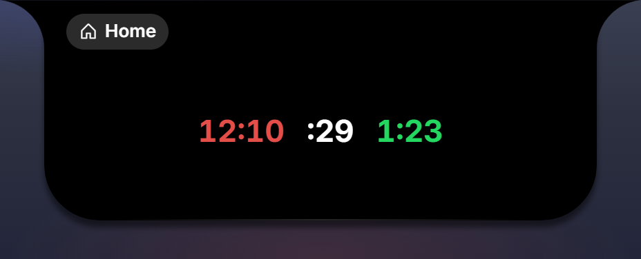
Repeaters
ui.list
One subtree per element of a field.list.
| Prop | Values | Meaning |
|---|---|---|
items | f.<list> | the list field |
item | function(it: <element refs>): node_t | builds the template from the element’s refs |
max | integer | default 16 |
dir | ui.dir.row | ui.dir.col | |
gap, justify, align | as ui.row | |
key | f.<list>.item.<field> | keyed updates: surviving items re-bind in place, only newcomers mount |
overlap | { item_w = px, max_gap = px } | the facepile mechanic: items spread up to max_gap, then overlap just enough to fit and gain separator rings |
An input function on an item node receives ctx.index (always 1-based) and ctx.item (the element’s data, present only when the list rows are resident). items with anything but a list ref raises ui.list: `items` takes a list field ref (field.list in the widget's fields); a list the widget did not declare raises ui.list: `items = f.<name>` is not a field.list(...) of this widget.
ui.list { items = f.faces, key = f.faces.item.name, overlap = { item_w = 35, max_gap = 10 },
  justify = ui.justify.center, item = function(it: face_refs_t): node_t return face_node(it) end }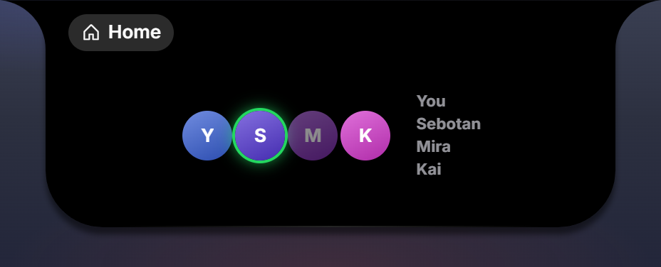
Interaction
ui.button
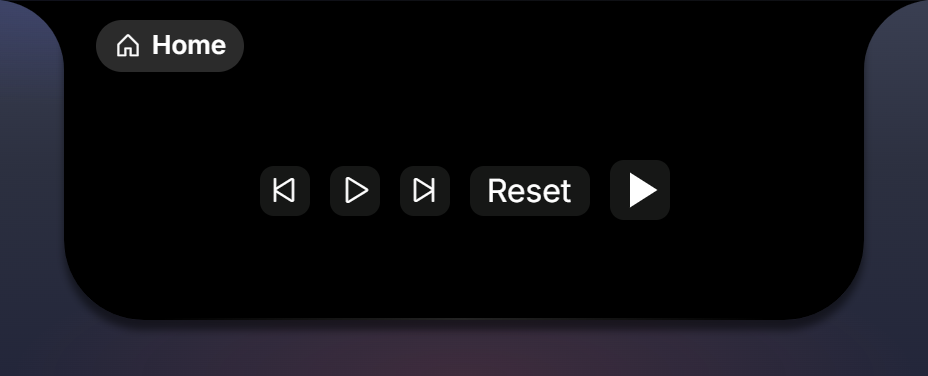
A tappable that calls its function. Content is glyph and/or text, or custom glyph children (a ui.shape). 25 by 25 by default, recessed, with hover and press feedback.
| Prop | Values | Meaning |
|---|---|---|
on_click | function(ctx: input_context_t) | the tap |
glyph | ui.glyph.* | the icon |
text | string | the label |
hint | "next" | "previous" | "play_pause" (a button_hint_t) | the transport this button is, so the view plays its optimistic motion on press (the album-art flip, the pause fade) before the player answers |
| children | the array part: a ui.shape | custom glyph content |
ui.button { on_click = function() perch.media.next() end, glyph = ui.glyph.skip_forward, hint = "next" }
ui.button { on_click = function() act.start_pause() end, w = 30, h = 30, bg = ui.bg.recessed,
  ui.shape { vb = { 24, 24 }, paths = { { d = "M8 5v14l11-7z", fill = ui.color.current } }, when = f.running:is_false() },
}
ui.field
An editable text input. Edits arrive on its own on_change.
| Prop | Values | Meaning |
|---|---|---|
value | f.x (a string field) | seeds the input; the field the edit updates |
on_change | function(text, ctx) | the edit, debounced 800 ms and flushed on blur |
multiline | boolean | textarea instead of a single line |
placeholder | string | |
max | integer | max length |
on_change without value raises ui.field: `on_change` needs `value = f.<field>` so the edit knows its field.
ui.draw
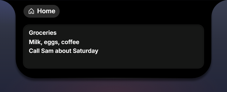
A metered canvas painted by a Lua function. Both props are required.
| Prop | Values | Meaning |
|---|---|---|
data | f.x | the trigger: the painter runs when this field is pushed |
painter | function(g: painter_t, data, w: number, h: number) | records ops on the g canvas it is handed |
Size comes from at = { x, y, w, h } (default 64 by 64) or the w/h props. The painter also runs for the seed a w:preview{...} supplies and for a preview.luau thumbnail, so a hand-painted dial looks the same in the Layout gallery and on the Workshop item as it does live. See Draw.
ui.draw { at = { 8, 14, 64, 64 }, data = f.hands, painter = draw_face }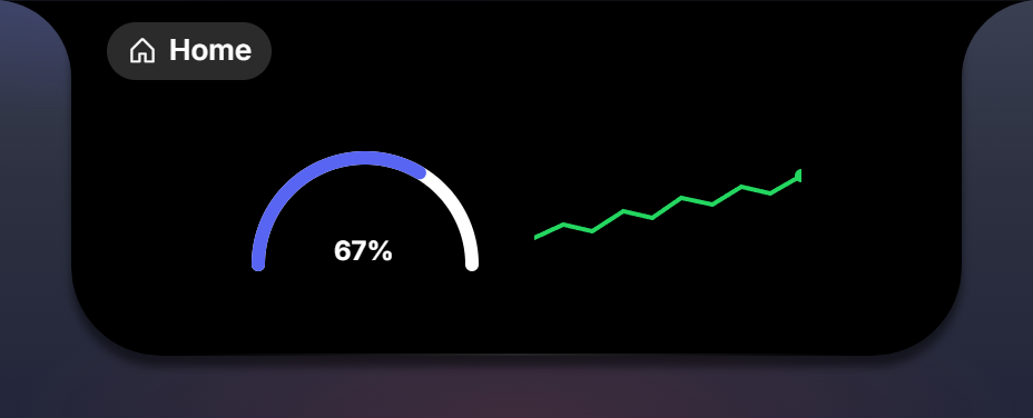
Shared props
Every node accepts these.
Layout
| Prop | Values | Meaning |
|---|---|---|
w, h, min_w, min_h, max_w, max_h | 0..2000 | px; like CSS width and height, still flex-shrinkable unless flex = 0 |
flex | number | 0 = natural size, never grow; 1 = fill |
pad | ui.gap.xs | .s (6) | .m (10) | .l | { t, r, b, l } | padding |
margin | { t, r, b, l }, each -50..50 | negatives overlap neighbours |
align_self | ui.align.start | .center | .finish | .stretch | .baseline | override the parent’s cross-axis alignment for this node |
at | { x, y } or { x, y, w, h } | position inside a ui.frame |
anchor | ui.anchor.center | make at the center point |
| whole pixels | images, shapes | at/w/h on fractions are rounded at build and reported as a warning (images and shapes pixel-snap) |
show | ui.show.single | ui.show.dual | "page_left" | "page_right" | show only in that form; see Widgets |
Style
| Prop | Values | Meaning |
|---|---|---|
color | a color, or f.x (a field.color()) | text and glyph color; currentColor for children |
bg | a surface role (ui.bg.*), a color, a gradient, or f.x | background |
radius | number px, or "chip" (7) | "card" (12) | "art" (18) | corner radius |
border | ui.border.none | .rim | .rim_strong | an inset hairline |
shadow | ui.shadow.none | .float | .recess | .soft | |
ring | { width 0..6, color } | a crisp outline |
glow | { blur 0..40, color } | a soft colored halo |
opacity | 0..1 |
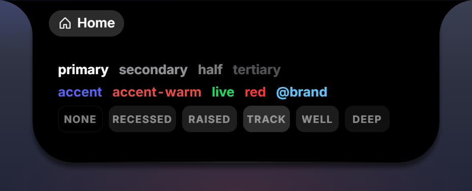
Surface roles for bg: ui.bg.none, .recessed, .raised, .track, .well, .deep. Gradients:
bg = { dir = 150, stops = { "#9464d8", "#652fb1" } }                                   -- linear, dir in degrees
bg = { radial = "80% 65% at 32% 24%", stops = { "#ffffff66", "#ffffff00" }, offsets = { 0, 62 } }
2 to 8 stops; offsets are percents, at most one per stop. A data-bound color (bg = it.hue_css) honours #hex, hsl() / hsla() and the monogram gradient form; see Displays.
State
| Prop | Values | Meaning |
|---|---|---|
when | f.x (truthy), or a condition: f.x:is_true(), :is_false(), :eq(v), :ne(v), :gt(n), :lt(n), :is_empty(), combined with :both, :either, :negate_ | show the node only while the condition holds |
style | 1..8 rules condition:set { ... } | change looks while a condition holds; settable: color, bg, opacity, weight, ring, glow, z, gray (grayscale, the paused-media look) |
when with anything else raises ui.<name>: `when` takes a field ref (f.playing) or a condition (f.playing:is_false()); a style entry that is not a rule raises ui.<name>: `style` takes rules like f.playing:is_false():set { opacity = 0.5 }.
Interaction
| Prop | Values | Meaning |
|---|---|---|
on_click | function(ctx: input_context_t) | a left tap; ctx.button = "left" |
on_right, on_middle | function(ctx: input_context_t) | the other buttons; ctx.button says which |
on_scroll | function(ctx: input_context_t) | a wheel notch, at most once per 80 ms per node; ctx.steps is signed, positive is up |
hover | ui.hover.lift | .soft | .scope | lift pops the node up (dock icons); soft brightens slightly (button weight); scope defines a hover region for the two props below |
hover_show, hover_hide | true | on descendants of a hover = ui.hover.scope node: fade in, or fade out, while the scope is hovered (the dock’s name-to-usage label swap) |
Inside a repeater item ctx also carries index (1-based) and item (the element’s data). See Displays: inputs.
Motion
| Prop | Values | Meaning |
|---|---|---|
motion | ui.motion.halo | .nod | .pulse | .spin | a looping preset (the ringing avatar’s halo) |
rotate | -360..360, or f.x (a number field) | rotation in degrees, static or from data (clock hands) |
pivot | ui.pivot.center | .bottom | rotation origin |
flip | string | a glide anchor: nodes with the same flip on two surfaces morph into each other on surface changes; on a ui.image, also the art flip |
The enums
Every closed value set has an enum table, and its values are the wire strings, so a raw string still works where you prefer one.
| Enum | Members |
|---|---|
ui.role | title, value, h2, huge, big, label, body, meter, sub, unit, caps |
ui.color | primary, secondary, half, tertiary, accent, accent_warm, live, red, fill, island, well, current |
ui.bg | none, recessed, raised, track, well, deep |
ui.gap, ui.size | xs, s, m, l |
ui.align | start, center, finish, baseline, stretch |
ui.justify | start, center, finish, between, evenly |
ui.fit | cover, contain |
ui.border | none, rim, rim_strong |
ui.shadow | none, float, recess, soft |
ui.hover | lift, soft, scope |
ui.show | single, dual |
ui.motion | halo, nod, pulse, spin |
ui.pivot | center, bottom |
ui.anchor | center |
ui.envelope | wide, tall |
ui.palette | theme, art |
ui.dir | row, col |
ui.ticker_mode | clock, elapsed, countdown |
ui.ring_style | conic, stroke |
ui.glyph | every Phosphor glyph, snake_cased |
key (global) | every keyboard key, for hotkeys: key.P, key.F4, key.SPACE |
Two keys differ from their wire value because of Lua: ui.align.finish and ui.justify.finish are the string "end" (a keyword in Lua), and the underscored names are the hyphenated strings, so ui.color.accent_warm is accent-warm and ui.border.rim_strong is rim-strong. ui.glyph.gear_six is the glyph gear-six.
Colors
A color anywhere is one of:
- a role token from
ui.color:primary,secondary,half,tertiary(text tiers, brightest to faintest),accent,accent-warm,live(green),red,fill,island(the notch background, for separator rings),well(recessed insets),current(follows the node’s owncolor); - a palette name from your manifest:
"@brand"; - a hex literal:
"#rrggbb"or"#rrggbbaa"("#ffffff24"is 14 percent white); - a field ref to a
field.color()your Lua computed.
Prefer roles and palette names over literals: they follow the user’s theme.
Types
Every builder’s props are a named type in perch.d.luau: the shared props plus the builder’s own. What a display function returns is a node_t.
export type node_t = { type: string }
export type children_t = { node_t }
export type bind_t<T> = T | field_ref_t<T> | ((data: any) -> T)
export type node_props_t = input_props_t & {
w: number?, h: number?, min_w: number?, min_h: number?, max_w: number?, max_h: number?,
flex: number?, pad: pad_t?, margin: margin_t?, align_self: enum_t<"align">?, at: at_t?, anchor: enum_t<"anchor">?,
color: (bind_t<color_t> | field_ref_t<string>)?, bg: (bind_t<background_t> | field_ref_t<string>)?,
radius: (number | string)?, border: enum_t<"border">?, shadow: enum_t<"shadow">?, ring: ring_t?, glow: glow_t?, opacity: number?,
show: enum_t<"show">?, when: (field_ref_t<boolean> | condition_t)?, style: { style_rule_t }?,
motion: enum_t<"motion">?, rotate: bind_t<number>?, pivot: enum_t<"pivot">?, flip: string?,
}The shared props, as declared. input_props_t is on Input; condition_t and style_rule_t on Fields.
export type enum_t<T> = { __enum: T }
export type color_t = enum_t<"color"> | string
export type background_t = enum_t<"bg"> | color_t | linear_gradient_t | radial_gradient_t
export type linear_gradient_t = { dir: number, stops: { string }, offsets: { number }? }
export type radial_gradient_t = { radial: string, stops: { string }, offsets: { number }? }
export type ring_t = { number | color_t }   -- { width 0..6, color }
export type glow_t = { number | color_t }   -- { blur 0..40, color }
export type pad_t = enum_t<"gap"> | { number }
export type margin_t = { number }           -- { t, r, b, l }
export type at_t = { number }               -- { x, y } or { x, y, w, h }
An enum member is an opaque value that is its name on the wire; a colour is a role token, a #hex literal or a palette name; a background adds the surface roles and the two gradient tables.
export type container_props_t = node_props_t & { gap: (enum_t<"gap"> | number)?, align: enum_t<"align">?, justify: enum_t<"justify">? }
export type grid_props_t<E> = node_props_t & { cols: number?, gap: number?, row_gap: number?, align: enum_t<"align">?, justify: enum_t<"justify">?, items: list_ref_t<E>?, item: ((it: E) -> node_t)?, max: number? }
export type text_props_t = node_props_t & { text: (bind_t<string> | field_ref_t<number> | number)?, role: enum_t<"role">?, prefix: string?, suffix: string?, map: { [string]: string }?, max: number?, size: number?, weight: number?, tracking: number?, lines: number?, align: enum_t<"align">?, line: number?, caps: boolean? }
export type icon_props_t = node_props_t & { glyph: (bind_t<enum_t<"glyph">> | field_ref_t<string>)?, set: string?, size: (number | enum_t<"size">)?, color: bind_t<color_t>? }
export type image_props_t = node_props_t & { src: bind_t<string>?, fit: enum_t<"fit">?, fallback: node_t? }
export type shape_path_t = { d: string, fill: color_t?, stroke: color_t?, width: number?, cap: ("butt" | "round" | "square")?, join: ("miter" | "round" | "bevel")? }
export type shape_props_t = node_props_t & { src: string?, srcs: { [string]: string }?, pick: field_ref_t<string>?, vb: { number }?, paths: { shape_path_t }?, shapes: { [string]: { shape_path_t } }? }
export type bar_props_t = node_props_t & { value: bind_t<number>?, seek: boolean?, on_seek: input_handler_t?, step: number?, hot_at: number?, height: number?, track: color_t?, fill: color_t?, snap: boolean?, knob: boolean? }
export type ring_props_t = node_props_t & { value: bind_t<number>?, variant: enum_t<"ring_style">?, size: number?, thickness: number?, color: color_t?, track: color_t?, cap: boolean?, smooth: number? }
export type visualizer_props_t = node_props_t & { levels: field_ref_t<{ number }>, bars: number?, bar_w: number?, gap: number?, grow: ("scale" | "height")?, gradient: { string }?, palette: enum_t<"palette">?, floor: number?, radius: number? }
export type sparkline_props_t = node_props_t & { points: field_ref_t<{ number }> | record_ref_t<chart_record_t>, stroke: color_t?, stroke_down: color_t?, area: boolean? }
export type ticker_props_t = node_props_t & { mode: enum_t<"ticker_mode">, value: (record_ref_t<clock_record_t> | field_ref_t<number>)?, offset: field_ref_t<number>?, h24: field_ref_t<boolean>?, format: string?, size: number?, weight: number?, role: enum_t<"role">?, caps: boolean? }
export type overlap_t = { item_w: number, max_gap: number? }
export type list_props_t<E> = node_props_t & { items: list_ref_t<E>, item: (it: E) -> node_t, max: number?, gap: number?, justify: enum_t<"justify">?, align: enum_t<"align">?, dir: enum_t<"dir">?, overlap: overlap_t?, key: field_ref_t<any>? }
export type button_hint_t = "next" | "previous" | "play_pause"
export type button_props_t = node_props_t & { glyph: enum_t<"glyph">?, text: string?, hint: button_hint_t?, on_click: input_handler_t }
export type field_props_t = node_props_t & { value: bind_t<string>?, multiline: boolean?, placeholder: string?, max: number?, on_change: change_handler_t? }
One per builder, in the order of this page. draw_props_t, painter_t and paint_style_t are on Draw.
Limits and validation
| Limit | Value |
|---|---|
| nodes per tree | 512 |
| depth | 16 |
| paths per shape set | 256 |
| shape sets | 32 |
| path data | 8,000 characters |
style rules | 8 |
| gradient stops | 2 to 8 |
ui.list items | 16 by default (max) |
ui.grid items | 64 by default (max) |
Two layers catch mistakes. The builders raise as your file runs (ui.visualizer: unknown prop 'barw', ui.text takes no children, ui.image: fallback must be a ui.* node, and for a string where a binding belongs the spelling that works: ui.text: `bind` is not a prop; bind a field ref: text = f.title), which is where most typos die. What survives that is checked by the loader against the same validator Perch uses at render time, and rejected with the exact path: display.children[1].children[2]: component 'text' has no prop 'colour', display.item: shape width is 0..10, display.children[3]: unknown component 'txt'. Paths are 1-based into children and name item for repeater templates. A tree that loads cannot fail at render.