
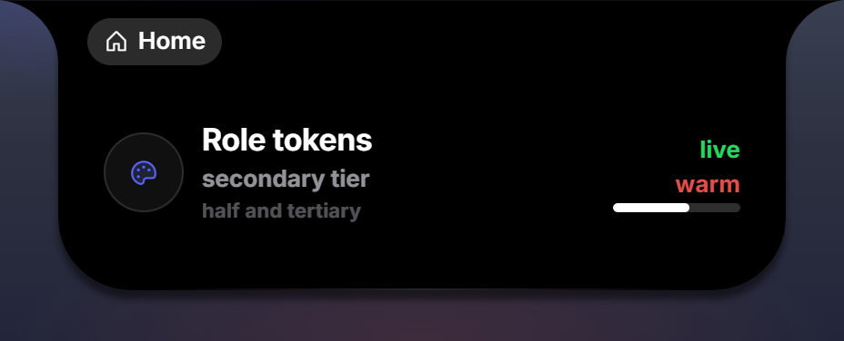
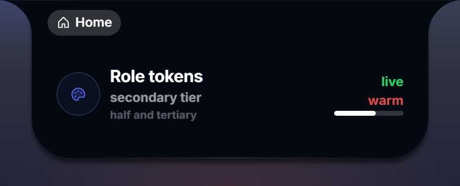
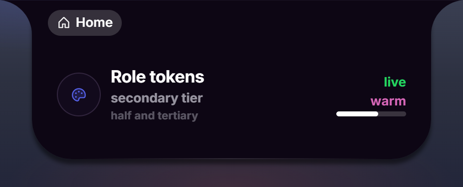
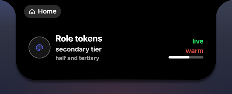
A theme recolors Perch: the island, surfaces, text tiers, accents, rims and shadows. Geometry, radii, spacing and typography stay Perch’s. Themes are declared in mod.json as pure data; a package may ship themes alone, or themes alongside widgets.
{
  "id": "nord-theme",
  "title": "Nord",
  "version": "1.0",
  "api": 3,
  "themes": [
    {
      "id": "nord",
      "label": "Nord",
      "tokens": {
        "island": "#2e3440",
        "surface_recessed": "#3b4252",
        "surface_raised": "#434c5e",
        "text_primary": "#eceff4",
        "text_secondary": "rgba(236, 239, 244, 0.62)",
        "accent": "#88c0d0",
        "accent_warm": "#d08770",
        "live": "#a3be8c",
        "rim": "inset 0 0 0 1px rgba(255, 255, 255, 0.08)"
      }
    }
  ]
}
A package needs no entry file to ship only themes; mod.json with themes is a complete package.
Fields
| Field | Rule |
|---|---|
id | [a-z-], 1 to 24 characters (theme ids are [a-z-]{1,24}) |
label | the name in the Appearance picker; defaults to the id |
tokens | an object of token name to value; any token may be omitted and keeps Perch’s default |
Tokens
Colors accept #rgb to #rrggbbaa and rgb(...) / rgba(...). Shadows accept a CSS shadow value (up to 160 characters; digits, letters, #, ( ) , . - % and spaces).
| Token | What it colors |
|---|---|
island | the notch and panel background |
surface_recessed | inset surfaces: boxes, buttons, bar tracks |
surface_raised | raised surfaces: popups, chips |
surface_deep | the deepest inset (the clock dial) |
text_primary | the brightest text tier |
text_secondary | the second tier (sub, label roles) |
text_half | the half-strength tier |
text_tertiary | the faintest tier |
accent | the primary accent |
accent_warm | the warm accent |
live | the green: presence, speaking rings, positive deltas |
fill | the generic filled element (bar fills) |
track | bar and ring tracks |
danger | the red |
hairline | dividers |
rim | the inset hairline on border = ui.border.rim (shadow value) |
rim_strong | the stronger rim (shadow value) |
shadow_island | the notch’s drop shadow (shadow value) |
shadow_float | shadow = ui.shadow.float (shadow value) |
shadow_recess | shadow = ui.shadow.recess (shadow value) |
Any other key fails the load with theme <id>: unknown token '<key>' (colors+shadows only); a value that does not parse fails with theme <id>: bad value for '<key>'. A rejected theme never reaches the picker and cannot take the overlay down.
How themes and widgets meet
Widgets that use role tokens and palette names follow the active theme automatically; hex literals do not. A theme may also remap a mod’s @palette colors wholesale. Exactly one theme is active at a time, chosen under Settings, Appearance; Perch’s own black is the permanent fallback.
Perch ships three themes as builtin packages (midnight, plum, high-contrast): read them for complete token sets.